Adios, Bobbin Threadbare
January 10, 2025
Tags: blog development loom games suda51
The dawn of a new age begins!
We’ve been trapped inside for a few days due to the 2025 Los Angeles Wildfire apocalypse. It’s not going great here, I’ll be honest! People will text or call to check in and my response should be “yes I’m safe but I live in LA and I’m very sad!” but I usually just give them an update. But I’m not here to talk about that!
No, today I’m here to usher in a new era for this blog because as I’ve been sheltered inside due to toxic smoke, I’ve spent some of that time tinkering with this website and decided to give it a proper makeover. While I’m not officially ready to launch the new theme and color scheme (oops I lied), I am ready to say goodbye to a very old friend, Mr. Bobbin Threadbare.
Loom was not the first adventure game I played, that honor would go to, if my memory is correct, 1982’s Robin Hood Adventure for the Apple II. I believe it wasn’t even the first LucasArts game I had played, but it was the first I played alone, by myself, all the way through the end. It was my home alone after school game for a spell and it really stuck with me. Trying to describe it to my friends and family after I beat it felt like I had live through a fever dream. Even though it wasn’t truly finished, I love it and still think it’s one of the best adventure games every created, A REAL WORK OF ART! So naturally when building this website i decided that any blog without a featured image would default to Bobbin Threadbare.

For a time, it was all I needed. But as I started to develop more of a personality for the iconography here, he started to feel more and more out of place.

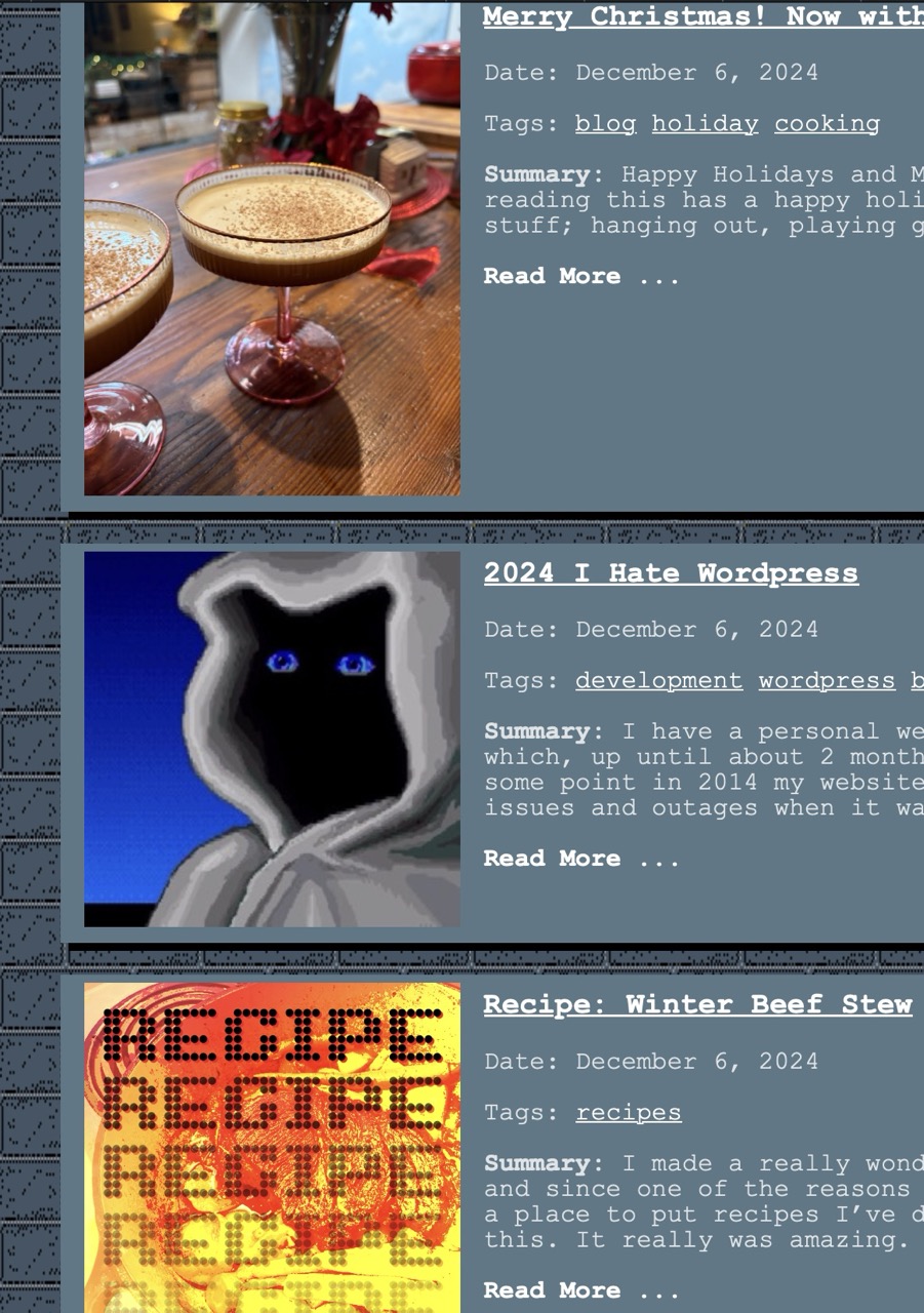
See what I mean? Well this serves as a fond farewell to the man, the myth, the legend, the default blog icon, Mr. Bobbin Threadbare. So long, old friend! May we meet again as swans flying past the fabric of time.
For the new icon I wanted something that matched the direction I had started with the featured images for things like link dumps, recipes, media posts and tutorials. All of this kind of lives outside of the camera database and photo gallery. I’m still considering making those pages have a different style all together but I’m not quite ready for that. These icons were all inspired from some of the graphic design in Suda51’s No More Heroes 3. This is on the top of my favorite games of all time lists so this shouldn’t come as a surprise. There is a great use of pixelation and gradients and I wanted to borrow from that.
This is reminding me that the featured images are all different sizes, I need to export them all out so they are consistent, especially since everything is now held within the asset folder of hugo. BRB. Okay that’s done! These were all over the place in terms of size and I’ve got them down much smaller. They should all start to load faster, which is a goal of mine.
The next thing I’m going to do is change the color scheme. I know, I know, you’re RIOTING out there, “don’t change it!” “you’re a monster!” “we love the blue!” AND I HEAR YOU but I think it’s time. I like the brick background I found but I want to use an asset I made myself, which is a frame of 35mm that wasn’t exposed and it has some sick ass grain. It will be better to transition to a darker color scheme, anyway I think. Maybe I’ll leave the option, for all you diehards out there… maybe not.
Also I’m changing the logo to something more cool k thx bye


